Archive for the ‘Street art’ Tag
Women and Cities: Swoon
Filed under: art, Art, Street Art | Tags: CELLspace, Street art, swimming cities, swoon, urban art, Urban space, women in the city
 Comments (1)
 Twitter is emerging as another way of getting information about urban art and street artists (I’m on Twitter as @scotinoz), and it was through Twitter that I learned today that Swoon’s Swimming Cities of Serenissima has arrived in Venice. For those of you who don’t know Swoon’s work, she specializes in large (life-sized) block-printed paper cut-outs, which are then wheat-pasted onto surfaces, which might be the walls in a gallery or in the street. She is based in New York City, but her work appears in cities all over the world. Here’s a great video of Swoon giving a presentation about her work at the Museum of Modern Art in New York:
While walking through Haight Ashbury with Russell Howze, veteran archivist of stencil art, I saw this piece by her:

It’s a quintessential Swoon piece: a woman, rendered in intricate detail, beautifully drawn, and placed with care in a space in which she appears to be glimpsed by the passer-by while she is engaged in some quotidian activity.
While I was in San Francisco, Russell also took me to the Luggage Store Gallery. This gallery has featured in an earlier post on this blog (see ‘On tagging’, January 2009), and the gallery is certainly worth visiting just for a look at the archive of tags provided by its stairwell, but on the day that I was there it was also the site of an exhibition of Swoon’s work.
Instead of simply being pasted onto walls, as happens when Swoon (or any other artist) puts up work in the streets, here she had pasted them onto cardboard or wood, or other found objects, which were then displayed in a manner which lent them depth, perspective, dimensionality. These photos will give you an idea of what the works looked like:


Swoon had made use of all the space available, even extending her work over the gallery’s windows:

For the spectator, this provided the novel experience of standing inside and looking through an artwork to the street outside (a neat re-working of the constraints enforced on much urban art, in which the artwork can exist either in the street or in the gallery, but not in both places).
While one strand of Swoon’s work focuses on figures in the everyday, The Swimming Cities of Serenissima derives from what is emerging as another major interest, the built environment. As the website for The Swimming Cities of Serenissima states, the vessels are inspired by ‘dense urban cityscapes and thickly intertwined mangrove swamps from [Swoon’s] Florida youth’. It involves three vessels, ‘built from salvaged materials, including modified Mercedes car motors with long-tail propellers’, which have been sailed by a crew of 30 artists from Slovenia to Venice. The vessels resemble ships but also evoke the floating skyscrapers of Gotham or the counter-intuitive wonders of Venice itself.
This is the third floating sculpture made by Swoon (previously, she created the Miss Rockaway Armada which sailed down the Mississippi River, and The Swimming Cities of Switchback Sea, seven rafts which sailed from Troy, NY, to New York City). Reading about the remarkable floating cities created by Swoon made me remember another highlight from my visit to San Francisco, visiting CELLspace. This is a fantastic place combining studios and gallery space for at-risk youth and artists in the Mission District, to see Card Burg, a city being constructed from cardboard:


It was absolutely wonderful to wander among the towering skyscrapers and to see the small spaces of everyday lives within the metropolis – an incredible urban artwork about the nature of life in urban space.
I’m pretty sure that for anyone lucky enough to see one of Swoon’s swimming cities, the experience will be similar: wonder, awe and sheer pleasure. But I’ve also been thinking about these two separate strands in Swoon’s work: the individual and the urban. Individuals going about their business, sitting on the stoop, walking through the city. And cities: fantastic, miraculous spaces wrought by the imagination. It makes me wonder whether it’s possible for the two to be brought together: if the contemplative woman can be allowed to exist within the urban setting.
Of course, you could argue that this is exactly what Swoon’s street images do: the paste-up of a woman is placed in urban space. But I wonder if we need more than that. When I saw Card Burg, I realised that part of the pleasure in visiting that imaginary city was brought about by the exhilaration of – literally – walking tall among the city’s buildings. The altered dimensions of Card Burg meant that I stood almost as tall as the skyscrapers.
Similarly, Swoon’s swimming cities shift perspective and dimension: the city is produced in inevitable miniature, and is thus, somehow, tamed. To me, what’s important here is the transformation that’s brought about of the experience of being a woman in the city. For far too many women, city spaces are still the location for sensations such as anxiety, fear, intimidation. Is it possible for an artist to create an image of being a woman in the city that can acknowledge that reality and that can still seem beautiful? This isn’t a criticism of Swoon’s work, which I find inspiring and hopeful and lovely. But it’s important to note how difficult it is for art to do justice to the fact that, for many women, ‘walking tall’ in the city is fraught with risk as much as pleasure.
Street art and ‘authority’
Filed under: art, Art, Street Art, graffiti | Tags: art, authority, graffiti, Obama administration, Street art, Union Lane, Wooster Collective
Comments (8) Once again, it’s been a long time between posts. The main reason for this is that I contracted whooping cough just before Easter: it turns out that whooping cough is a highly nasty illness and there’s good reason why we vaccinate kids against it. Anyway, while convalescent, I spent a lot of time online: reading blogs, browsing through some great street art websites, and, of course, spending a bit of time on Facebook. Amidst the productive procrastination of all those mad quizzes, recently there’s been some fascinating reading provided by the responses to questions being asked on Facebook by the Wooster Collective (questions which range from ‘what’s your favourite hangover cure’ to ‘what is the best city for street art’). One recent question asked respondents to say what impact they thought it would have if street art were legal. Reading the comments (most of which indicated that something would be lost if street art were legalized) started me thinking about street art and its relation to authority and to the various government bodies and organizations that we might call the ‘authorities’.
Around the same time that the Wooster Collective were asking this question, I received an email from Russell Howze, stencil artist and author of Stencil Nation (it’s also well worth checking out both his blog and Stencil Archive, his fabulous resource on stencil art). In the email, he described the Anti-Graffiti Super Huddle (website here), a recent initiative in San Francisco designed to reduce, contain and eliminate graffiti in the city. Russell’s concerns were that the anti-graffiti strategies seemed to be coming thick and fast, and he asked whether any arts organizations were participating in these debates (to provide a counter-voice) and whether any politicians might want to develop initiatives that recognized the positive value street art could have for a city.
So here we have a great example of how the encounter between street art and authority is usually configured (the Anti-Graffiti Super Huddle with its objectives of zero tolerance and graffiti prevention) and we can also see how difficult it is to imagine ways in which that encounter might be transformed – an enterprise which would certainly be challenging but which could have many benefits for artists (perhaps reducing the chances of being fined or prosecuted) and for inhabitants of urban spaces (in allowing street art to flourish rather than struggle in the periods in between massive buffing exercises).
Certainly of relevance to the possibility of transforming the encounter between street art and authority is the news that recently the Wooster Collective were invited to the White House. Earlier in May, Marc and Sara, along with around 60 representatives from grassroots arts organizations, attended a briefing session with aides from the Obama administration and participated in workshops focusing on a range of key issues to do with the arts. As they say in the post on their website recounting the event, the issue they wanted to raise was ‘the need to better understand the issues around public and private space’ (for the full post, look here and scroll down to the entry for 13 May 2009).
In some ways, it’s no surprise that the Obama administration would invite individuals interested in street art to such a meeting. The Obama campaign demonstrated that it understood the positive capacities of street art – particularly so in relation to the widespread appearance in public space of the image of Obama created by Shepard Fairey. (You can read about this image and its role in the campaign here.) Fairey talks about his creation of the image in this video:
But in other ways, of course, it’s nothing short of mind-boggling that a government would engage in this sort of outreach towards individuals who have championed artwork that is oftentimes illicit. After reading about the Wooster Collective’s visit to the White House, I tried to imagine the equivalent in other countries – Gordon Brown including Banksy in a round table on the future of the arts in the UK, say, or Kevin Rudd inviting the Everfresh boys to Canberra for a discussion about arts funding.
The comparison isn’t quite an exact one, however: the Wooster Collective are not artists themselves; they are enormously supportive of street art in general and have promoted the work of a wide range of artists in many countries, and have generally raised awareness about street art in the community on an incredible scale. But they are not themselves known for engaging in the production of illicit images, and I’m guessing that this distinction is still important for those in authority, when they issue invitations to participate in such debate.
I am only speculating here – I don’t know who else was invited to the White House: there may have been a street artist there as well (but I’m guessing that Marc and Sara would have said if there had been). But once we get over the surprise and delight that such a meeting took place, what are the outcomes that we might hope for when street art, like Mr Smith, ‘goes to Washington’?
It’s an interesting question – partly because I’m still unsure of what this could lead to. I can see that there are a lot of things that can be gained in terms of the symbolic support it gives to street art(ists) and the potential for parlaying this kind of recognition into all sorts of consciousness-raising efforts. It’s hard to think of concrete outcomes partly because we really haven’t seen an encounter like this, at this level of power, and with so much potential. But I’m also pretty sure that there are some risks too, and this is because there are so many instances of the encounter between street art and authority at lower levels of government making things harder for street artists or leading to some pretty strange results.
Here’s one example: in Melbourne, a few yeas back, the City of Melbourne agreed to support a project whereby artists would be permitted to paint the walls in Union Lane, in the city centre. Union Lane is a narrow lane that connects one of the major retail thoroughfares (Bourke Street) with another shopping street running parallel to it, Little Collins Street. Many of Melbourne’s laneways possess great charm and character; Union Lane does not – it was a forbidding, gloomy stretch of laneway, its unrelieved concrete walls were plain grey on one side and on the other had been painted with an uninspired, bland mural which pictorialized various civic virtues (and which had been heavily tagged).
The Union Lane project was a fantastic idea, in many ways, and it was brought into being through the hard work of a lot of people. Several well-known, highly respected artists and experienced artists were commissioned to paint in the massive work that was to cover both walls for the entire length of the laneway (which is pretty long – a city block). These artists also mentored younger artists on the project. Visiting street artists joined in. The result was a collage of styles and images produced by dozens of individuals. Passers-by took photographs; tourists visited the site; many talked with the artists and learned something about street art as they watched it being carried out. You can see the lane as it was before, and the process of developing and painting the laneway in this video:
It sounds brilliant, and in many ways it was. Surely this would be an example of the encounter between street art and authority working at its best? Well, a few unexpected problems arose. Although the presence of a high quality piece on a wall usually inspires respect from other writers or artists (that is, they don’t go over the work), the Union Lane paintings have quickly been tagged. Some people have speculated that the stencilled words ‘Street art permit: City of Melbourne’ might imply to some that the site is one where anyone can and should put up, rather than a site to be looked at.
It’s also my suspicion that the initiative demonstrates how easy it is for there to be a clash between the expectations of those in ‘authority’ and the norms and practices of street art culture. The City of Melbourne put time, effort and money into the project, and as such, wanted to protect their investment and preserve the result. Graffiti writers and street artists, however, did not necessarily view the site or the project as one which deserved permanence and preservation (two things which are not really high on the list of priorities for many graffiti writers anyway) beyond the recognition of the skills of various artists who contributed to the project.
And so, as time has passed, Union Lane is gradually becoming shabbier. Because of this, there’s a risk that it will be held up some day as an example of why such initiatives fail to achieve any positive results. Could this have been avoided? Well, one possible strategy would have been to have recognized at the outset that permanence isn’t highly valued in street art and graffiti cultures and that a range of temporary surfaces (such as hoardings) could be attached to the walls of Union Lane for artists to paint and re-work over time, with the hoardings being removed and replaced periodically.
Such an approach would no doubt bring with it its own particular issues and potential problems, but at least it would demonstrate that those in ‘authority’ are not just dispensing largesse (which can be revoked) but are actively trying to understand how street art and graffiti work.
So I guess my main point is this: in any encounter with authority, street art and street artists need to expect that all will not go according to plan, and that any plan needs to incorporate contingencies as to what might happen down the track, when the expectations of those in authority are not met.
And I think, at the moment, this will always happen, because there’s such an asymmetry between the positions of those with power (councils, the Obama administration) and those without it (graffiti writers, arts organizations, street artists). (And it would be great if the Wooster Collective’s encounter with authority could lead to a discussion as to how street artists might work to render that relationship less asymmetrical.)
I don’t mean to be pessimistic, but over the years I have seen many instances of street artists or graffiti writers trying to engage positively with ‘authority’, and I have had some experience of trying to do so myself. If someone loses out, it’s usually the artist. (And I would love to hear from anyone who has had experience of trying to work with ‘authority’ – whether successful or unsuccessful.)
So when street art ‘goes to Washington’, it’s going to be essential to have a clear idea of what street art can gain from the encounter, what ‘authority’ can offer street art, and what risks might lie ahead, even with an administration that has shown remarkable understanding and appreciation of all that street art can offer the community.
2008 – the best and worst….
Newspapers are full of these ‘best of…’ and ‘worst of…’ lists right now, and reading some of them got me thinking about some of the great (and not so great) moments in art and cinema this year. What follows is a really incomplete – and really subjective – list of images that I’ve been happy to live by in 2008. In no particular order (and apologies for repeating some topics already written about, but they still deserve to be mentioned as some of the great moments of 2008):
• Jose Parla’s work. I saw his show at Elms Lesters Painting Rooms in London, and I think his images are gorgeous. You can read more about Jose’s work here.
• Miso and Ghostpatrol’s show, ‘Nesting and Dying’, at metro5 Gallery in Melbourne. Beautiful works, beautifully installed in the space.
• Seeing Brad Downey’s presentation of a series of short films about his ‘street sculptures’, at the Tate in London.
• The Kill Pixie show at Until Never Gallery in Melbourne.
• C215’s work, all over London in July. Some of it is still around, like this:

• The JR show at Lazarides. Haunting.
• Being shown some new works by Elbow Toe, freshly unpacked and ready to hang, at Stolen Space in London.
• Meeting the artist who paints these cats all over Amsterdam:

• Walking around San Francisco with Russell Howze.
• Regan Tamanui’s portrait of my daughter. Love it!
• Spotting new Invader works around Melbourne several times during this year. How many did he put up? Fantastic!
• Watching the Mikosa mural evolve.
• The Cans Festival in the Leake Street tunnel. Awesome. Both times.
• Meggs’s show at Dont Come gallery in Melbourne.
• Seeing Hunger, by Steve McQueen.
• Seeing the Peak Hours sticker being put up on the London Underground. I would still love to know whose work that is… Thanks to everyone who contacted me about the sticker.
• Seeing Gilbert (of Gilbert & George) walk past on Brick Lane.
• The Sidney Nolan show at the NGV. I’m not an Australian, so I don’t have the attachment to the Ned Kelly iconography that an Aussie does, but I still thought Nolan’s images were breath-taking.
• Meeting Laser 3.14.
• Logan Hicks’s show at Stolen Space in July. No space could have suited his works more.
Regrets….
Every year has to have some of these. Again in no particular order:
• Too many great shows missed, one way or another. MuTate Britain in London, the Poesia Urbana show at Famous When Dead Gallery, Acorn’s solo show in Melbourne, Locust Jones at Until Never. And many more. What can you do?
• Not photographing the ‘little diver’ stencil by Banksy in Cocker Alley before it had silver paint poured over it. I walked past it so many times, always thinking, ‘yeah, I’ll take a picture some other day’. Strange how something becomes part of the cityscape and then – gone.
• The Victorian State Government’s new anti-graffiti laws. Perhaps 2009 will bring some greater appreciation of street art in Victoria – but I will not be holding my breath.
• The Bill Henson debacle. So many people should be ashamed of their roles in this business. And its aftermath continues, with new, incredibly strict, rules governing the production of images of children.
• All those times I didn’t have my camera with me when I came upon some amazing image on the wall.
This is the last post for 2008. Back in a few weeks.
Losing Banksy…
Filed under: Art, Street Art | Tags: Banksy, Banksy effect, Melbourne, stencil art, Street art
Comments (7) There’s been a lot of discussion since the weekend about what’s happened to the famous Banksy stencil in Melbourne’s CBD. This stencil is famous for two reasons: first because not many of Banksy’s works, painted during a visit here in 2003, remain in Melbourne; and, secondly, because plexiglass plastic had been screwed over the top of it to protect and preserve it, thus singling it out from the mass of stencils and street artworks in Melbourne.
It seems that someone has poured silver paint down the back of the plexiglass, so that the image is now obscured. On top of the plexiglass, the words ‘Banksy woz ere’ have been written in black marker pen.
Here’s what it all looks like (photo sent to me by Miso, who found it on Nice Produce):

You can see a news report about this here.
I have some pretty mixed reactions to what’s happened. Yes, it’s definitely sad to see the end of a cute little stencil. And it’s a bit frustrating if the stencil has been destroyed in order to provide whoever did it with a quick thrill of excitement.
But…
There’s a lot more that needs to be said about what has happened. For example, why get worked up about this image in particular? Other images done by Banksy in Melbourne have also been lost over the years, such as this classic ‘Laugh now…’ ape, which I photographed in Richmond back in 2003:

It is long gone, painted over by Yarra City Council. Its disappearance wasn’t remarked by the media. So why is the loss of the ‘little diver’ so noteworthy now? Ah, but wait…. In recent years, Banksy has been the object of much media interest as well as seeing his works suddenly increase in value (in fact, a version on canvas of the same image that I photographed in Richmond in 2003 sold at Bonhams ‘urban art’ auction in London, in February this year, for 80,000 pounds).
And many other stencils and street artworks have also disappeared, without finding themselves to be the subject of news reports or mass ‘mourning’. Why is their loss not so noteworthy? Works have been put up by local and visiting artists all over Melbourne, only for them to be painted over, or torn down, and thus vanish. Perhaps it’s only the disappearance of Banksy’s work that merits comment in the mainstream media?
I also suspect that the media is reporting on this because the work appears to have been destroyed by an individual who can be portrayed as a ‘vandal’. As I mentioned, Yarra City Council painted over Banksy’s apron-wearing ape, along with rats such as this one…

When a council, or a property owner, buffs street artworks or graffiti, the media doesn’t represent them as ‘vandalising’ the images – instead, no doubt the council would be seen as exercising its ‘graffiti management strategy’ and a property owner would be ‘cleaning’ the surface.
I’m sure a large part of the media’s interest in what has happened to Banksy’s stencil is because it allows them to have their cake and eat it too – they can express regret at the loss of the stencil while implicitly condemning whoever did it.
To me, the whole event brings up a number of issues that are worth thinking about. One relates to the protective plexiglass that was placed over the stencil. The news story that I read stated that it was the building owners who asked for the protective covering; in conversations with people around Melbourne in the past I’ve heard it said that Melbourne City Council decided to protect the stencil. I don’t know which is correct, and in some ways it doesn’t matter, because what interests me is less who put the plexiglass there and more the fact that suddenly there has developed the desire to preserve street artworks along with (apparently) the technology to do so.
I started thinking about this recent phenomenon back in July, when I visited Cargo in London. Cargo is a desperately hip bar in Shoreditch, famous for its courtyard area where the walls have been painted by a range of street artists. Some of its panels get painted over as different artists visit: for example, in July there was a fantastic panel painted by Logan Hicks; by October when I went back, it had gone and a new piece was up instead. Exceptions to this process of renewal are two panels by Banksy, which have been covered in plexiglass. You can see one of these here (and in the photo you can see some weird reflections caused by the plexiglass covering):

The Cargo courtyard demonstrates the emergence of a hierarchy in the way mainstream culture is responding to street art. It’s a hierarchy that is clearly related to ‘the Banksy effect’, in which Banksy’s works are treated differently than others (they sell for more money, they are the subject of more media interest, they are ‘protected’ where others are not).
Leaving the ‘Banksy effect’ aside (and I’m not trying to be critical of Banksy here, since this phenomenon has arisen mainly through the responses of others to his work rather than through direct actions of his own), is the desire to ‘preserve’ street art a good thing?
I have to say I’m suspicious of what the plexiglass represents. It seems like an attempt to pin down something that shouldn’t be ‘frozen’ in this way. And am I sad at the loss of the little diver stencil? I know I have expressed sadness at ‘losing’ an image in the past (see the entry ‘Losing the image’ in October this year), but in this instance I am much more ambivalent. I think what has been done to the image draws our attention to the plexiglass as much as it destroys the image behind it. As such, if it makes people think about what hypocrisy might be present when one work (or the works of just one artist) can be placed behind plexiglass, then perhaps that will assist the public debate that still needs to take place around street art. And as for whether this is an act of ‘vandalism’, well, in some ways it might be, but if we take a moment to look at what has actually been done, then it’s a little more complex than that.
How can we read the meaning of writing ‘Banksy woz ere’? Well, it is quite a funny, literal, demonstration of what has happened. A Banksy stencil was here, and now these words are here instead. Or, Banksy himself was here in person, and is now gone. And of course ‘Banksy woz ere’ evokes the famous ‘Kilroy was here’ graffiti of the 1970s onwards, in which an anonymous male character seemed to travel the world, leaving only his enigmatic images on walls. A bit like Banksy, really.
So if the stencil had to disappear (and most street artworks will disappear, some day, one way or another), then this might not be a bad way to go.
More JR
Filed under: Art, Street Art | Tags: JR, photography, Street art
Leave a comment It will be clear from my earlier post (‘The power of vision’: JR and the women) that I am fascinated by the work of JR, the French street artist who works with portrait photography to make extremely interesting interventions around race, gender and violence.
I’ve been trying to find online clips from the film that I saw in London, which concerned the women of the favela Morra da Providencia in Rio de Janeiro. No luck so far, but what I have found is a brief excerpt from another part of the 28 Millimetres: Women project, described as a ‘trailer’ and called ‘Women Are Heroes’. JR travelled to a range of African countries which could variously be described as at best ‘post-conflict’ and at worst ‘at war’: Liberia, Sierra Leone, and Kenya among others. This little film shows many of the same cinematic devices used in the one I saw in London – the jittery camera work (used to a lesser degree here), the hypnotic, repetitive music, the telling of stories of violence and loss. It has its differences too: in this film, we hear JR himself narrating his intentions for the project, and it features a slightly more conventional, documentary-style telling of one woman’s story.
There are other films on YouTube showing different aspects of JR’s work (for example, in the housing projects on the outskirts of Paris), all of which are well worth watching too. But this one has an intensity that comes very close to the experience I had, sitting in the Lazarides gallery in London, with women’s faces pasted all over its ceiling, floor and walls, watching the women of Morro da Providencia on screen. If you do watch the little film I’ve included here, I should also give a bit of a warning: some of this film is very distressing.
Fade to grey
Filed under: Art, Street Art | Tags: Banksy, fading, JR, Miso, Street art
Comments (1) Recently I wrote about buffing, the different ways in which councils, governments and property owners seek to erase any graffiti or street art that has been added to a wall or surface.
For many works of street art, the buff represents their fate, sometimes far sooner than the artist would like. One day the image is there, next day it’s gone – painted over, scraped off.
But sometimes an image evades the buff and remains in place for a long, long time. Its longevity might derive from its being tucked away in a hard-to-notice spot, so that years go by and the work has actually only been seen by a few people. Or it might have been placed somewhere that’s hard to reach – hard for the artist who put it there, but also hard for any cleaning crew, which means that a work can stay up for years. And sometimes, even when a work is prominently visible, easy to access, and illegally located, it somehow escapes the buff, and just slowly and gradually disappears, fading back into the stone.
Within street art culture, there seems to be a lot of admiration, and often rightly so, for newly painted work: images that look glossy and shiny, which haven’t been weathered or degraded in any way (by the addition of tags or the application of posters on top, for example). And I’ve heard people say that work which is fading ‘looks old’, ‘tired’ and so on, and to a certain extent that’s true.
But some artists like to see the effects of these external forces and circumstances on their artworks. Miso, for example, is interested in the peeling and fraying that can arise when a pasted-up image experiences the effects of hot sun, rain, wind. And JR’s pasted-up photographic posters register the impact of the environment pretty fast – his work on the façade of the Tate Modern was repaired by the gallery after only a matter of weeks in place, thanks to a damp British summer. For these artists, though, the possibility of deterioration isn’t a problem, but is rather an integral part of their artistic practice – it’s something they actively invite.
Beyond this, though, I think it’s also worth looking at fading artworks, even when that gradual disappearance and deterioration isn’t part of the artist’s stated intentions. It takes quite a time for a painted work on stone to fade – usually months or even years, which means these greying images have a lifespan that’s quite remarkable given the frequency of buffing and going-over by other artists.
Here’s a fading Banksy. To see the remains of it, it’s best to click on the image to make it bigger. Look at the top step, where there are some words still faintly visible:

It reads ‘designated picnic area’ and is stencilled on the steps of an office building in a busy road in Shoreditch in London. It’s scarcely legible now, almost vanished back into the steps, its humour and incongruity about to depart the scene.
And take a look at this one:

It looks like a red smudge on the pavement, but it’s the remains of another Banksy. If you look more closely at the wall next to the smudge, you can see the traces of the two rats stencilled on the walls:

These rats were kitted out as waiters in a fancy restaurant, with the red smudge actually a red carpet. The rats have faded more than the red carpet, and you need to know what was there in order to make sense of what remains. I’m indebted in this respect to Martin Bull’s useful little book, Banksy Locations and Tours (details available from his website), which has a photograph of the work before it started to fade.
So how should we make sense of the fading artwork? Do we dismiss it as occupying some transitional zone between ‘freshness’ and oblivion? Do we paint over it so that new work can take its place? Does its faded nature mean that it is no longer worth noticing or thinking about?
In some ways, I think it’s the very ‘in between-ness’ of the fading image that makes it interesting. Not quite here and not quite gone, maybe having an almost historical value as a record of what was done in the past, but gradually relinquishing any claim on our attention amidst the visual hubbub of the contemporary city. So next time you walk through the streets, perhaps it’s worth paying homage to these fading images, these survivors who have, through chance or circumstance, escaped both the buff and the privileging of the new work of art.
‘The power of vision’: JR and the women
Filed under: Art, Street Art | Tags: art and violence, JR, Lazarides, photography, portraits, Street art
Leave a comment JR is a French photographer who used to paste up in the street the poster-sized printouts he had made of his photographs. Since he did this without the permission of the property owner on whose building he would stick the artwork, his art was, of course, illegal. JR has become one of the most internationally celebrated ‘street’ artists (have a look at his website to get a sense of his fantastic work). He is one of the six artists who were selected to exhibit their work on the front of the Tate Modern in London earlier this year (see the blog entry in October, ‘Street art and the museum’).
He has built this huge international reputation around a simple but clever artistic device. He makes portrait photos: head-and-shoulders shots, waist-upwards shots, extreme close-ups of faces or of facial features such as eyes. These photographs are then blown up. It’s through this simple device that JR has become famous – the photograph replicated and expanded in size, pasted up around the streets. These portraits were also made within the parameters of a political point of view. JR’s artworks draw the spectator’s attention to issues of race, ethnicity and poverty, all of which are crucial issues in a city such as Paris where JR began pasting up his work.
Over the years, it seems that JR’s images have become larger. While the scale of his artwork on the Tate was obviously determined by the size of the building, there were additional JR images around London during the northern summer that confirmed his ability to position a very large work in a really fascinating way. Have a look at this image:

What you can see is an image that is several storeys tall, situated on a building in Old Street in Shoreditch. The massive buildings next to it become simply part of the artwork’s frame. There’s also something of the trompe l’oeuil about the image: it’s black and white, it’s clearly not real, its perspective is all wrong for it to work as a straightforward in situ illusion, but there is something about the image – deriving from its nature as a photograph – which means that the spectator looks into it as well as at it. It is as though two separate worlds have been made to rub up against each other.
While in London in October, I saw JR’s show called 28 Millimetres: Women (it’s just a small part of his massive 28 Millimetres project much of which focuses on post-conflict societies in Africa, more details on JR’s website, and on this aspect of the project see this link).
JR took photographs of some of the inhabitants of Morro da Providencia, a favela in Rio de Janeiro. As is his usual practice, he blew up the photographs and turned them into massive posters which he pasted onto the sides of walls and buildings in the favela. He also used some of these to make some more conventional ‘fine’ artworks, and others were blown up to the enormous sized images which covered some buildings in the street outside. In addition, he made a film in the favela, which features the artworks he made for the buildings but which is also very much an artwork in its own right.
The show took place in the two Lazarides galleries (one in Greek Street, and the other on Charing Cross Road, both in Soho), and on Manette Street, a small street which runs between the two galleries (here’s a link to the Lazarides website and its information about the show). The Greek Street gallery contained the works which most conformed to the genre of the ‘fine’ artwork – that is, individual works, hung on the gallery walls.
These works were mainly photographs, sometimes small, sometimes blown up to considerable size (though nothing that could rival the building-sized images outside). Some work were pasted onto wooden panels, or sheets of rough wood, so that the face or figure in the image enters into a kind of relationship with the texture of the wooden surface, which in some works is fairly smooth but in others is very rough-hewn. The paper covering the wood is often scratched, as if it has been scored with a knife or sharp nails, and thus although the wooden backing and framing of the images seems to give them a sense of place, even though they have been detached from their original home, the images also seem to register an injury…
In Manette Street, some of JR’s massive artworks had been pasted onto the buildings:


In the Charing Cross Road gallery, the walls and ceiling of the exhibition space were covered with printed ‘contact sheets’ of JR’s portrait subjects, replicated over and over in a manner that mimicked the continuous run of celluloid film, as you can see in this photograph:

And on a screen at the rear of the Charing Cross Road gallery, showing on a continuous loop was a short film – for me, the most extraordinary work within this incredible, multi-layered show.
As I’ve mentioned, the film focuses on Morro da Providencia, a favela built on a steep hillside in Rio de Janeiro. As with the multiple levels in the exhibition as a whole, the film combines several elements: music (which is electronic, both urgent and plaintive), some archival news sources, the inclusion of voices speaking over the images (since they speak in Portuguese, the film is sub-titled in English), and a range of cinematographic techniques, including hand-held camera and time-lapse film. (I can’t say exactly how long it lasts – I watched this film several times over, on different days, and, although I tried to time its duration, each time I watched it I became so caught up in its narrative and its affect that I forgot to check my watch at its conclusion.)
The opening shows a news anchor relating a story about the shooting of some of the favela’s inhabitants, after the military opened fire on a public square. And this straightaway establishes the context for the film: the impact of militarised violence and torture inflicted upon a community. After this, the film shows, through time-lapse film, the installation of JR’s images throughout the favela, as they are pasted up on walls and outside houses. For this sequence, the camera is positioned quite a distance away and well below the favela, so that its entire upward sprawl can be seen, with the eyes, mouths, foreheads and faces of JR’s subjects now covering many of the vertical surfaces (there’s a still showing this on the Lazarides website).
But the film’s purpose is not (or not only) to record the installation of these works. JR’s objective is always portraiture, but here he produces a portrait which is multi-faceted enough to do justice both to the many individuals who face the video camera for JR and to the identity and space of the favela itself as a community dealing with the aftermath of police violence.
After the opening, the film is mainly composed of a series of sequences in which the camera races down alley ways and eventually halts in front of an individual – sometimes a woman, often a child, occasionally a man – or in which the camera follows someone through the interconnected rooms of their home, often ending up with that individual (child, woman or man) standing on the flat roof of their home with the favela rising and falling around them.
But although I say the camera ‘halts, or someone ‘ends up’, these words aren’t an accurate description of what the camera is doing, because they imply that some kind of even momentary stasis is reached. Instead, the camera is in constant motion, its film speeded up so that it fairly tears through the streets and alleys. Even when it is apparently at rest and in contemplation of an individual face, it is still recording at an accelerated speed, so that every single blink, glance or expression registers as a twitchy jitter in the subject’s face. In this way, what could have been a languid, leisurely excursus through the favela is rendered urgent, compelling (and fitting the film’s attempt to show how trauma registers within the everyday life of the community and its inhabitants).
And while the camera is building these jittery portraits of place and face, various voices speak (with sub-titled translations). At one point, a woman relates the experience of having to go to the garbage tip to search for pieces of her son’s body, after he had been taken away by soldiers and then killed. Her voice says: ‘it hurts your soul’. Another says: ‘I only give this interview because you are not from here and will take it far away, otherwise I wouldn’t, for I am afraid of the violence’. One boy narrates his witnessing the shooting of three children when the police started firing upon a demonstration in the public square. And another woman speaks of how Providencia had been neglected by artists, and how important JR’s intervention is for the community. She calls it ‘the power of vision’.
Many of the faces which constitute as the film’s jittery portraits are solemn, sombre or impassive. Occasionally a smiling face is shown – a young woman breastfeeding her baby, a little girl laughing. Many of the voices speak of how much they love Providencia, of how grateful they feel to have lived there. Such love, such gratitude, in the context of lives lived amid violence and loss, is amazing. The film completely succeeds in conveying the tension between a sense of the beautiful (the favela as a space of community and happiness) and the experience of violence (the faces whose camera-accelerated jitters seem to bespeak the pain they have undoubtedly suffered, and the favela as a site of loss).
And as such it is a text profoundly about trauma, about the inability to resolve such a contradiction. It is about witnessing violence, and about making art visible. It is about seeing the effects of violence, and about creating an artwork whose faces and eyes look outwards from the hillside towards the city whose police force has inflicted such harm. Through art, the houses are literally made to look, as walls and windows become eyes, faces, bodies. The film ends as night falls over Rio de Janeiro, and these faces, bodies and eyes fade into black, with the camera juddering the distant lights of Rio into a neon blur. Freeze frame, and then black. The film ends, but there is no ‘end’ to what we have seen.
Street art and the museum
Filed under: Art, Street Art | Tags: museums, Street art, Tate Modern
Leave a comment In the northern summer of 2008, from 23 May to 25 August, the Tate Modern art gallery in London hosted an exhibition called Street Art, curated by Cedar Lewisohn. The exhibition involved the installation of works by six artists on the front façade of the museum, plus film screenings, a program of talks, a walking tour around the area showcasing works in the street (a further five artists were commissioned to create works especially for the designated sites), and a Street Art Information Tunnel in the museum forecourt, showing short films, providing information, and with a tagging wall (textas and marker pens provided). There’s information about the exhibition and the artists in the Tate’s archive here. Lewisohn also produced a book on street art, which constitutes an extremely interesting account, contextualising street art in a broader way than many other commentators – see here for more details of the book.
The artists who were selected to exhibit on the Tate’s massive outer wall were: os gemeos (Brazil), Blu (Italy), Faile (the United States), Nunca (Brazil), JR (France), and Sixeart (Spain). The artists who exhibited works for the walking tour were 3TTMan, Spok, Nano 4814, El Tono and Nurla.
For all its several component parts, the most significant part of the exhibition was certainly the outer wall, featuring the works by the six international artists. These works were massive, as befits the size of Tate Modern (a former power station). The six works could be seen from a great distance: many visitors approach the Tate Modern from the north side of the Thames, walking across the elegant Millenium Bridge to the museum. These visitors were treated to an incredible view of the images and were able to watch them increase in size with each step across the bridge. You can get a sense of this in the image below:

Once in the museum forecourt, visitors gazed upwards at the outer wall, able to see the detail in each work – especially interesting in the case of the image by Blu. In this first picture, you can see the work as a whole; the second one shows the amazing detail.


Proximity to each image of course changed the perspective on it: standing beneath each one, the spectator was towered over by each image. Some, like this Faile piece below, were enormously powerful and dominating in appearance.

Others seemed to incorporate a kind of pathos despite their monumentality – like the yellowing skin and skinny limbs of the os gemeos figure, as you can see here:

JR’s pasted up image of a young man wielding a video camera was already in peeling tatters (thanks to the rain and wind that you can get in a British summer). On the first day I visited, repair work was being done on the JR image. This actually helps to show the dominating scale of the works, since you can see how small the cherry picker looks next to the photograph:

And here’s what it looked like a few days later:

Quick glimpses of the other works:


It can’t be denied that it was amazing to see such works, and to see them on the wall of as august an institution as the Tate Modern. But I have just a couple of misgivings about the experience….
First of all, the scale of the images. The sheer size of these works (as you can see, they were of course done with the assistance of cherry pickers and so on) almost takes them out of the domain of street art and puts them into the realm of something else. The work is, literally, elevated – raised up off the street, placed high on the façade of the museum. Looking at these huge, amazing works raises the question, ‘what is “street” about ‘street art”?’ Is it work done on the street? If so, then these works would obviously be excluded from that definition. Is it work done with a particular sensibility on the part of the artist? Is it work with a particular ‘look’ to it, a specific aesthetic? Is it some combination of these?
Although all six of the works had the requisite sensibility (all of the artists are well known for their previous work on the streets, legal and illegal), and although all of the works variously participated in the aesthetic that seems to characterise street art (an engagement with pop culture, contemporary politics, an awareness of spatiality, a willingness to manipulate image and genre), it’s also worth considering what happens when ‘street’ art meets the museum.
The debate around the tensions between art that is made for the streets and then exhibited in gallery space is well-rehearsed. But I think that those tensions are multiplied when artworks that are at least in some way related to the space of the streets are then brought into the realm of the museum.
Small galleries (which is where the majority of street artists exhibit their work, if they exhibit at all) really are, oftentimes, small. Of course, they are driven by lots of imperatives, some of them commercial, some of them about cementing a particular reputation for themselves within the gallery scene. But they are less often trying to make a statement about capturing the artistic zeitgeist, or cataloguing artistic worth, or building representative collections. Museums, on the other hand, are driven by exactly those objectives. That’s one of the reasons why the National Gallery of Australia’s purchase of prints of stencil art by street artists had such political and cultural significance – as a museum, the NGA’s interest in street art lends a kind of institutional validation to street art and the artists (something that is important to remember when governments attempt to pour scorn on the cultural value of street art, as has recently been happening in Melbourne).
So what cultural value is generated by the interest of the Tate Modern in street art? Well, of course, you could say it recognises something that has become hugely important in many British cities (especially London) and something which has become of particular cultural importance to young people. You could say that Lewisohn’s assembling of these particular works demonstrates an outward-looking worldview that see beyond any limited self-image of London as the global centre of street art (in his selection of six non-British artists for the exhibition).
All of these things would be correct. But there’s something else worth thinking about, in this consideration of the cultural value of the Tate’s street art exhibition, and in the encounter between street art and museum space. When I first heard that the Tate was putting on an exhibition about street art, I emailed the museum for information, and in their response, I found it very interesting that they said: ‘there is no work in the building, only on the front and in the area’.
This comment was made as part of a helpful and detailed email from the Information Department, and I initially didn’t give it much thought. But after going to the Tate and looking at the façade, and doing the walking tour, and visiting the ‘Information Tunnel’, I was struck by the fact that the ‘street art’ stayed outside the museum. And then struck again, weeks later, when I heard that the works on the outer wall had been removed when the exhibition ended in August.
Ephemerality as part of street art – a recurrent theme in the writings on this blog, and of course a key part of street art culture. But ephemerality is what we expect (and accept) when works are on the street. When they are part of a museum exhibition, why can’t the works be permitted to stick around? No-one, of course, is going to go over or tag works on the front of the Tate Modern (given that cherry pickers were needed to install the images, it seems hard to imagine other artists seriously being able to have much impact on any of these even if they wanted to). But it turns out that the museum can buff the works. The outer wall now looks the same as it ever was…
Since no works made it inside the museum as part of the exhibition, and since the outside has now been returned to its ‘normal’ appearance, there’s little evidence that the Tate ever had an exhibition showcasing street art (except for the items for sale in the gift shop). And that seems – well, ‘wrong’ is too strong a word for it. But think about it: if the Tate Modern bought an artwork by Warhol or by Rothko and then, after a few months, destroyed it… wouldn’t that seem strange? Those works by Blu, Faile, os gemeos and the others were fantastic and wonderful, and are now gone. That the museum played a part in their disappearance somehow feels disappointing to me.
On tourism, street art, and Melbourne
Filed under: Art, Street Art | Tags: Melbourne, Street art, tourism
Leave a comment Well, this topic certainly deserves a long post, which sadly I don’t have time to write at present. More later, I think. But I did want to note the latest instalment in the continuing saga of the State Government’s conflicted attitude to street art and graffiti in Melbourne.
On Monday, I noticed a story in The Age (our local broadsheet newspaper, for any non-local readers) which reported on how a recreation of Melbourne is the centrepiece of a food and wine festival at Disney World in Florida. Laneways painted with street art and graffiti are the location for small cafes serving different kinds of food – so far, so Melbourne, right? Well, today (Tuesday) a friend (thanks, Esther!) sent me a message with a link to a story in the Herald Sun, which is all hot under the collar about this, on behalf of Tim Holding, the Victorian Minister for Tourism and Major Events, who has apparently criticised his department for allowing Melbourne to be associated with graffiti: ‘graffiti is not the way we want Melbourne to be promoted to a global audience’, he says.
Tourism Victoria is, sadly, admitting that it has made ‘a mistake’ in allowing the graffiti panels to be included. I say ‘sadly’ because, for one thing, I would have preferred Tourism Victoria at least to have been consistent in its expressed views, given that it features street art in much of its promotional material. And for another thing, I would like the State Government to actually consider what it objects to about the association between Melbourne and street art. It seems so short-sighted and blinkered: street art in London has brought large amounts of money into previously cash-strapped areas like the East End and Shoreditch over the last 8-10 years. If the State Government here could at least participate in a discussion about the cultural value of street art and graffiti, it might not need to engage in such self-righteous huffing and puffing about a food and wine festival. Makes me wonder if Minister Holding has ever wandered around the laneways of Melbourne – spending time on such a pursuit might show him that, for many, food, wine and street art combine very nicely in this city of ours.
If you would like to read the Herald Sun story, it’s here.
There’s a forum for posting comments, too.
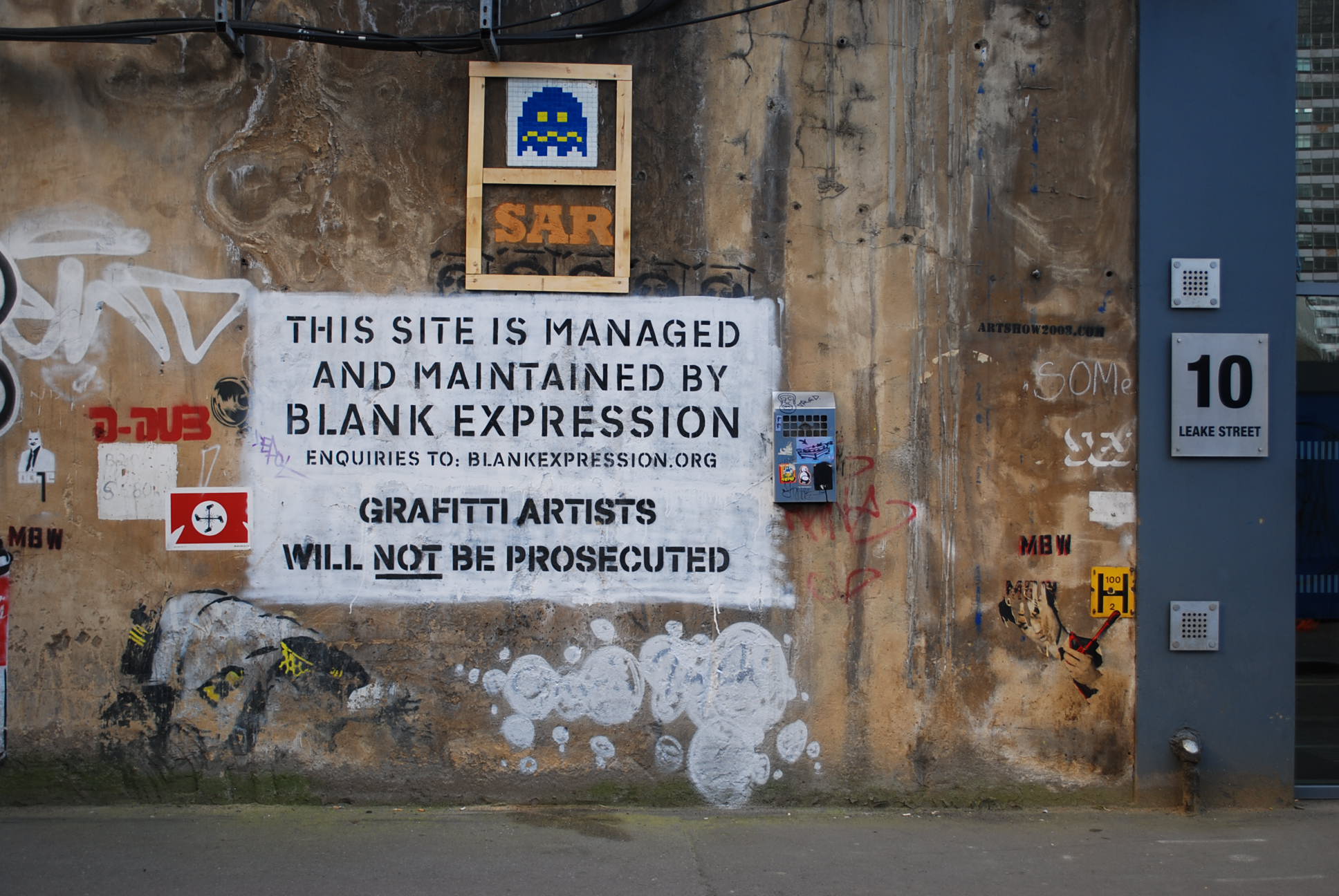
The Cans Festival (Mark 1)
Filed under: Art, Street Art | Tags: Banksy, Cans Festival, London, Street art
Leave a comment In late May this year, artists from a range of different countries (Australia, the US, Holland, France, Portugal and more) were flown to London to take part in creating the Cans Festival, a massive exhibition of stencil art.
The location was a disused tunnel in Leake Street, near Waterloo Station. This tunnel had had its fair share of graffiti applied to it in the past, but the Cans Festival turned it into a unprecedented display of street art.
The location was kept secret while the artists went to work over a period of several days, but once it became known where the Festival was to take place, hundreds of people queued for up to three hours at a time to see the artworks. The tunnel was filled with people, some adding their own stencils or tags to the walls, other photographing what they saw. For a sense of the massive public enthusiasm for the event, do a search on Flickr for ‘Cans Festival’ or watch any of the many videos made at the Festival:
When I visited London in July, things had quietened down at the site. There were still people visiting (around 20 people when I was there), but it was possible to take photographs without other people in the shot, and to stand back and look at the sheer scale of the place and the display (the tunnel is a couple of hundred metres long, and its curved walls around 10 metres high).
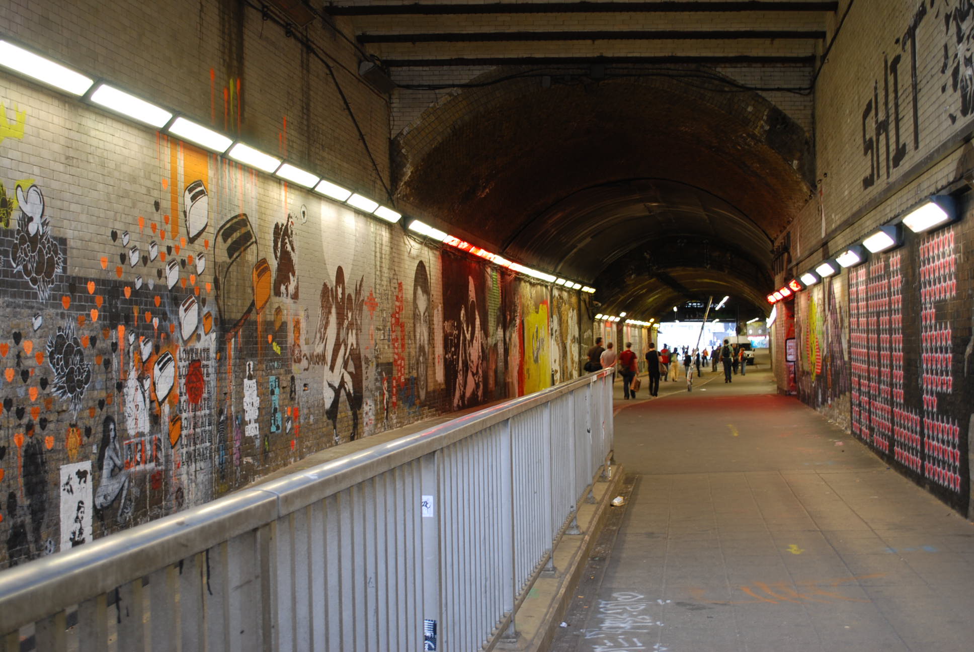
The ‘official’ artworks – by artists such as Vexta, Tom Civil and DLux (all from Australia), Vhils (Portugal), C215, Blek Le Rat and Jef Aerosol (France), Lex-Sten (Italy), Kaagman (Holland), Logan Hicks and Faile (the US), Pure Evil, Eine and Banksy (the UK) – were now surrounded by unofficial additions. Sometimes people had stencilled an image, sometimes they had tagged over other people’s work. The tunnel was crammed with images: railings and posts had been sprayed, as had the ground: someone had sprayed a stencil version of a scalectrix racing track, complete with cars, through the tunnel.
Some of the images were simply amazing. I’ve written already about the works by Logan Hicks (see the entry ‘In anticipation…’). Other memorable ones included this work by Vhils, a young Portuguese artist:
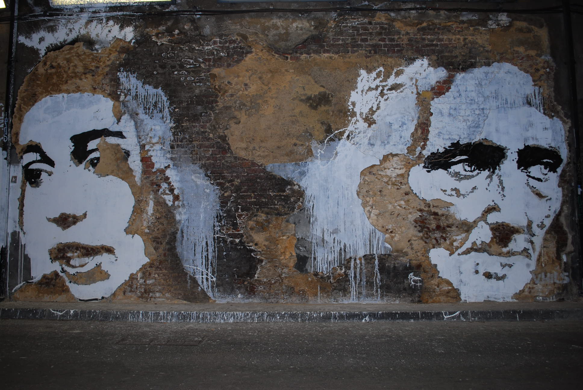
For a sense of its scale, try to imagine that I (who stand 1.78m tall) would reach eye level on these faces. And there were dozens of these amazing images: a fantastic work by Eine, a huge and delicate paste-up by Faile, several of C215’s faces, some glittering figures by Pure Evil.
And of course several works by Banksy, an artist derided by some but considered by many to be single=handedly responsible for popularising street art around the world. The tunnel had previously contained some old works by Banksy: in this photograph you can see a faded ‘snorting copper’ kneeling at ground level and surrounded by more recent additions for the Festival:
Of the several Banksys in the Festival, my favourite was a massive image of a hoodie-wearing, knife-holding, bleeding boy. The scale of this work is huge, and yet it is extremely detailed, showing Banksy’s skill as an artist (often forgotten in the brou-ha-ha that always follows his various stunts).

In the neatest of copperplate script to the left of this boy’s sneaker, it reads, ‘I am starving’. Many dismiss Banksy’s penchant for a catchphrase as glib, but I found that this work had a certain resonance, in a city where the homeless and hungry are present on many street corners. Too hard to do justice to Banksy’s work in this post: watch this space for further discussion of his work.
To see all these works in one place – and in the street, not in a gallery – I walked up and down, photographing, photographing, unable to stop smiling. My daughter, who is 6, said: ‘mama, I’ve never seen so much graffiti in one place’, and it was very true.
But I don’t want to overlook the unofficial additions to the Festival, made by the hundreds of people who came and stencilled or tagged their own words and images at the site. Here’s one, out of thousands:
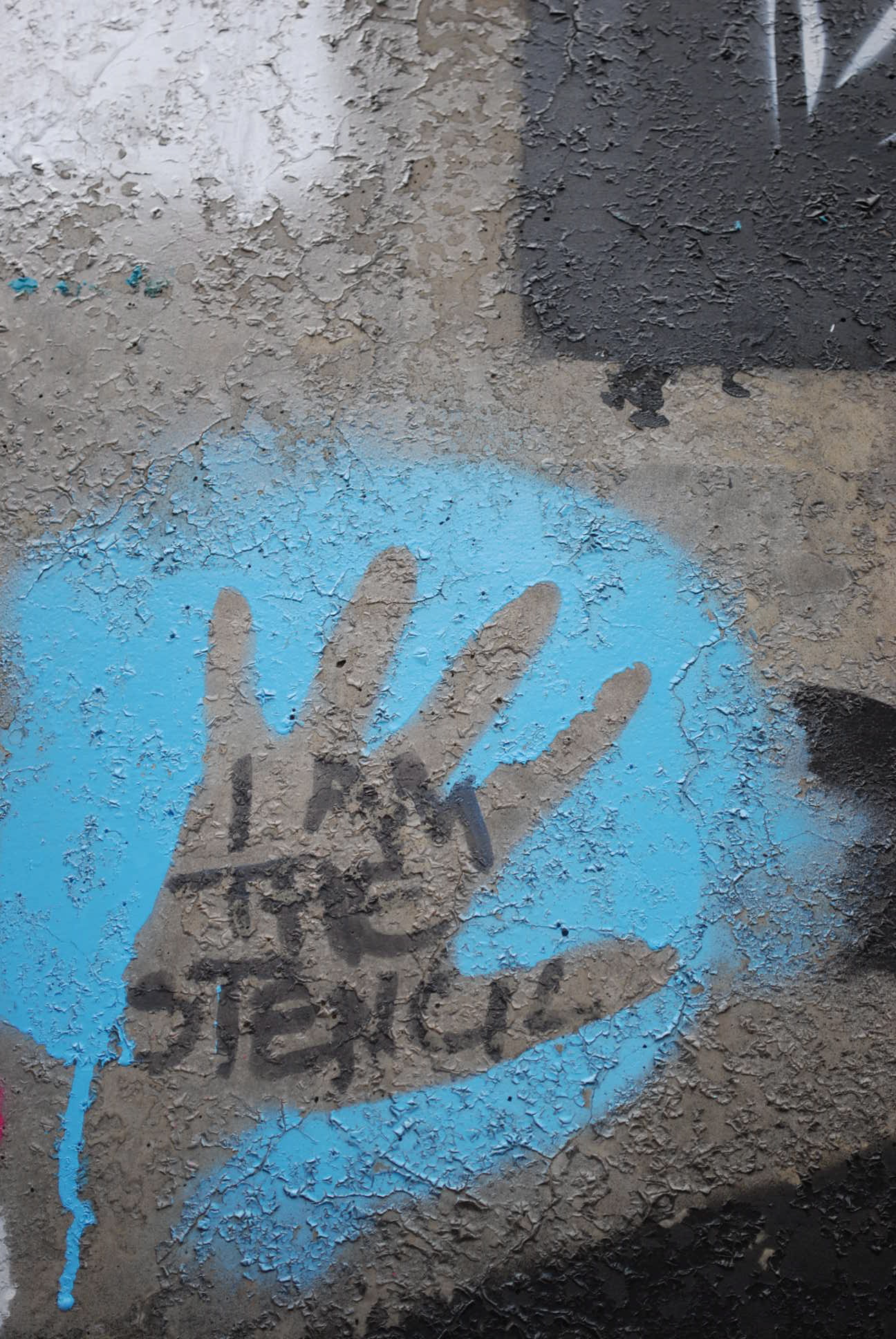
I love this. I like to imagine that the artist perhaps didn’t have any stencils with them when visiting and simply borrowed a spraycan from someone, in order to spray around their hand.
And who, you may ask, made all of this possible? Banksy. Not just through his popularising of street art, but far more directly in that he paid the airfares of the visiting artists and covered the costs of the event, which many estimate to be a cool half a million pounds.
Perhaps reading about the Cans Festival might make you want to go and see it for yourself? Well, yes, you should go and see it, but in fact all of the works I’m writing about no longer exist. That’s right: last weekend a whole new crew of artists were brought in and the tunnel has been entirely repainted. Take a look at the official website here for details of the artists involved. Cans Festival Mark 2 !
How long will the work be there? I don’t know, but I really hope it will still be there when I visit London again in October. But if it’s not – well, contrary to those who seek to preserve street artworks by putting plexiglass over them (as has been done with Banksys in London and in Melbourne), ephemerality is part of the nature of street art.
