Archive for the ‘art’ Category
Women and Cities: Swoon
Filed under: art, Art, Street Art | Tags: CELLspace, Street art, swimming cities, swoon, urban art, Urban space, women in the city
 Comments (1)
 Twitter is emerging as another way of getting information about urban art and street artists (I’m on Twitter as @scotinoz), and it was through Twitter that I learned today that Swoon’s Swimming Cities of Serenissima has arrived in Venice. For those of you who don’t know Swoon’s work, she specializes in large (life-sized) block-printed paper cut-outs, which are then wheat-pasted onto surfaces, which might be the walls in a gallery or in the street. She is based in New York City, but her work appears in cities all over the world. Here’s a great video of Swoon giving a presentation about her work at the Museum of Modern Art in New York:
While walking through Haight Ashbury with Russell Howze, veteran archivist of stencil art, I saw this piece by her:

It’s a quintessential Swoon piece: a woman, rendered in intricate detail, beautifully drawn, and placed with care in a space in which she appears to be glimpsed by the passer-by while she is engaged in some quotidian activity.
While I was in San Francisco, Russell also took me to the Luggage Store Gallery. This gallery has featured in an earlier post on this blog (see ‘On tagging’, January 2009), and the gallery is certainly worth visiting just for a look at the archive of tags provided by its stairwell, but on the day that I was there it was also the site of an exhibition of Swoon’s work.
Instead of simply being pasted onto walls, as happens when Swoon (or any other artist) puts up work in the streets, here she had pasted them onto cardboard or wood, or other found objects, which were then displayed in a manner which lent them depth, perspective, dimensionality. These photos will give you an idea of what the works looked like:


Swoon had made use of all the space available, even extending her work over the gallery’s windows:

For the spectator, this provided the novel experience of standing inside and looking through an artwork to the street outside (a neat re-working of the constraints enforced on much urban art, in which the artwork can exist either in the street or in the gallery, but not in both places).
While one strand of Swoon’s work focuses on figures in the everyday, The Swimming Cities of Serenissima derives from what is emerging as another major interest, the built environment. As the website for The Swimming Cities of Serenissima states, the vessels are inspired by ‘dense urban cityscapes and thickly intertwined mangrove swamps from [Swoon’s] Florida youth’. It involves three vessels, ‘built from salvaged materials, including modified Mercedes car motors with long-tail propellers’, which have been sailed by a crew of 30 artists from Slovenia to Venice. The vessels resemble ships but also evoke the floating skyscrapers of Gotham or the counter-intuitive wonders of Venice itself.
This is the third floating sculpture made by Swoon (previously, she created the Miss Rockaway Armada which sailed down the Mississippi River, and The Swimming Cities of Switchback Sea, seven rafts which sailed from Troy, NY, to New York City). Reading about the remarkable floating cities created by Swoon made me remember another highlight from my visit to San Francisco, visiting CELLspace. This is a fantastic place combining studios and gallery space for at-risk youth and artists in the Mission District, to see Card Burg, a city being constructed from cardboard:


It was absolutely wonderful to wander among the towering skyscrapers and to see the small spaces of everyday lives within the metropolis – an incredible urban artwork about the nature of life in urban space.
I’m pretty sure that for anyone lucky enough to see one of Swoon’s swimming cities, the experience will be similar: wonder, awe and sheer pleasure. But I’ve also been thinking about these two separate strands in Swoon’s work: the individual and the urban. Individuals going about their business, sitting on the stoop, walking through the city. And cities: fantastic, miraculous spaces wrought by the imagination. It makes me wonder whether it’s possible for the two to be brought together: if the contemplative woman can be allowed to exist within the urban setting.
Of course, you could argue that this is exactly what Swoon’s street images do: the paste-up of a woman is placed in urban space. But I wonder if we need more than that. When I saw Card Burg, I realised that part of the pleasure in visiting that imaginary city was brought about by the exhilaration of – literally – walking tall among the city’s buildings. The altered dimensions of Card Burg meant that I stood almost as tall as the skyscrapers.
Similarly, Swoon’s swimming cities shift perspective and dimension: the city is produced in inevitable miniature, and is thus, somehow, tamed. To me, what’s important here is the transformation that’s brought about of the experience of being a woman in the city. For far too many women, city spaces are still the location for sensations such as anxiety, fear, intimidation. Is it possible for an artist to create an image of being a woman in the city that can acknowledge that reality and that can still seem beautiful? This isn’t a criticism of Swoon’s work, which I find inspiring and hopeful and lovely. But it’s important to note how difficult it is for art to do justice to the fact that, for many women, ‘walking tall’ in the city is fraught with risk as much as pleasure.
Street art and ‘authority’
Filed under: art, Art, Street Art, graffiti | Tags: art, authority, graffiti, Obama administration, Street art, Union Lane, Wooster Collective
Comments (8) Once again, it’s been a long time between posts. The main reason for this is that I contracted whooping cough just before Easter: it turns out that whooping cough is a highly nasty illness and there’s good reason why we vaccinate kids against it. Anyway, while convalescent, I spent a lot of time online: reading blogs, browsing through some great street art websites, and, of course, spending a bit of time on Facebook. Amidst the productive procrastination of all those mad quizzes, recently there’s been some fascinating reading provided by the responses to questions being asked on Facebook by the Wooster Collective (questions which range from ‘what’s your favourite hangover cure’ to ‘what is the best city for street art’). One recent question asked respondents to say what impact they thought it would have if street art were legal. Reading the comments (most of which indicated that something would be lost if street art were legalized) started me thinking about street art and its relation to authority and to the various government bodies and organizations that we might call the ‘authorities’.
Around the same time that the Wooster Collective were asking this question, I received an email from Russell Howze, stencil artist and author of Stencil Nation (it’s also well worth checking out both his blog and Stencil Archive, his fabulous resource on stencil art). In the email, he described the Anti-Graffiti Super Huddle (website here), a recent initiative in San Francisco designed to reduce, contain and eliminate graffiti in the city. Russell’s concerns were that the anti-graffiti strategies seemed to be coming thick and fast, and he asked whether any arts organizations were participating in these debates (to provide a counter-voice) and whether any politicians might want to develop initiatives that recognized the positive value street art could have for a city.
So here we have a great example of how the encounter between street art and authority is usually configured (the Anti-Graffiti Super Huddle with its objectives of zero tolerance and graffiti prevention) and we can also see how difficult it is to imagine ways in which that encounter might be transformed – an enterprise which would certainly be challenging but which could have many benefits for artists (perhaps reducing the chances of being fined or prosecuted) and for inhabitants of urban spaces (in allowing street art to flourish rather than struggle in the periods in between massive buffing exercises).
Certainly of relevance to the possibility of transforming the encounter between street art and authority is the news that recently the Wooster Collective were invited to the White House. Earlier in May, Marc and Sara, along with around 60 representatives from grassroots arts organizations, attended a briefing session with aides from the Obama administration and participated in workshops focusing on a range of key issues to do with the arts. As they say in the post on their website recounting the event, the issue they wanted to raise was ‘the need to better understand the issues around public and private space’ (for the full post, look here and scroll down to the entry for 13 May 2009).
In some ways, it’s no surprise that the Obama administration would invite individuals interested in street art to such a meeting. The Obama campaign demonstrated that it understood the positive capacities of street art – particularly so in relation to the widespread appearance in public space of the image of Obama created by Shepard Fairey. (You can read about this image and its role in the campaign here.) Fairey talks about his creation of the image in this video:
But in other ways, of course, it’s nothing short of mind-boggling that a government would engage in this sort of outreach towards individuals who have championed artwork that is oftentimes illicit. After reading about the Wooster Collective’s visit to the White House, I tried to imagine the equivalent in other countries – Gordon Brown including Banksy in a round table on the future of the arts in the UK, say, or Kevin Rudd inviting the Everfresh boys to Canberra for a discussion about arts funding.
The comparison isn’t quite an exact one, however: the Wooster Collective are not artists themselves; they are enormously supportive of street art in general and have promoted the work of a wide range of artists in many countries, and have generally raised awareness about street art in the community on an incredible scale. But they are not themselves known for engaging in the production of illicit images, and I’m guessing that this distinction is still important for those in authority, when they issue invitations to participate in such debate.
I am only speculating here – I don’t know who else was invited to the White House: there may have been a street artist there as well (but I’m guessing that Marc and Sara would have said if there had been). But once we get over the surprise and delight that such a meeting took place, what are the outcomes that we might hope for when street art, like Mr Smith, ‘goes to Washington’?
It’s an interesting question – partly because I’m still unsure of what this could lead to. I can see that there are a lot of things that can be gained in terms of the symbolic support it gives to street art(ists) and the potential for parlaying this kind of recognition into all sorts of consciousness-raising efforts. It’s hard to think of concrete outcomes partly because we really haven’t seen an encounter like this, at this level of power, and with so much potential. But I’m also pretty sure that there are some risks too, and this is because there are so many instances of the encounter between street art and authority at lower levels of government making things harder for street artists or leading to some pretty strange results.
Here’s one example: in Melbourne, a few yeas back, the City of Melbourne agreed to support a project whereby artists would be permitted to paint the walls in Union Lane, in the city centre. Union Lane is a narrow lane that connects one of the major retail thoroughfares (Bourke Street) with another shopping street running parallel to it, Little Collins Street. Many of Melbourne’s laneways possess great charm and character; Union Lane does not – it was a forbidding, gloomy stretch of laneway, its unrelieved concrete walls were plain grey on one side and on the other had been painted with an uninspired, bland mural which pictorialized various civic virtues (and which had been heavily tagged).
The Union Lane project was a fantastic idea, in many ways, and it was brought into being through the hard work of a lot of people. Several well-known, highly respected artists and experienced artists were commissioned to paint in the massive work that was to cover both walls for the entire length of the laneway (which is pretty long – a city block). These artists also mentored younger artists on the project. Visiting street artists joined in. The result was a collage of styles and images produced by dozens of individuals. Passers-by took photographs; tourists visited the site; many talked with the artists and learned something about street art as they watched it being carried out. You can see the lane as it was before, and the process of developing and painting the laneway in this video:
It sounds brilliant, and in many ways it was. Surely this would be an example of the encounter between street art and authority working at its best? Well, a few unexpected problems arose. Although the presence of a high quality piece on a wall usually inspires respect from other writers or artists (that is, they don’t go over the work), the Union Lane paintings have quickly been tagged. Some people have speculated that the stencilled words ‘Street art permit: City of Melbourne’ might imply to some that the site is one where anyone can and should put up, rather than a site to be looked at.
It’s also my suspicion that the initiative demonstrates how easy it is for there to be a clash between the expectations of those in ‘authority’ and the norms and practices of street art culture. The City of Melbourne put time, effort and money into the project, and as such, wanted to protect their investment and preserve the result. Graffiti writers and street artists, however, did not necessarily view the site or the project as one which deserved permanence and preservation (two things which are not really high on the list of priorities for many graffiti writers anyway) beyond the recognition of the skills of various artists who contributed to the project.
And so, as time has passed, Union Lane is gradually becoming shabbier. Because of this, there’s a risk that it will be held up some day as an example of why such initiatives fail to achieve any positive results. Could this have been avoided? Well, one possible strategy would have been to have recognized at the outset that permanence isn’t highly valued in street art and graffiti cultures and that a range of temporary surfaces (such as hoardings) could be attached to the walls of Union Lane for artists to paint and re-work over time, with the hoardings being removed and replaced periodically.
Such an approach would no doubt bring with it its own particular issues and potential problems, but at least it would demonstrate that those in ‘authority’ are not just dispensing largesse (which can be revoked) but are actively trying to understand how street art and graffiti work.
So I guess my main point is this: in any encounter with authority, street art and street artists need to expect that all will not go according to plan, and that any plan needs to incorporate contingencies as to what might happen down the track, when the expectations of those in authority are not met.
And I think, at the moment, this will always happen, because there’s such an asymmetry between the positions of those with power (councils, the Obama administration) and those without it (graffiti writers, arts organizations, street artists). (And it would be great if the Wooster Collective’s encounter with authority could lead to a discussion as to how street artists might work to render that relationship less asymmetrical.)
I don’t mean to be pessimistic, but over the years I have seen many instances of street artists or graffiti writers trying to engage positively with ‘authority’, and I have had some experience of trying to do so myself. If someone loses out, it’s usually the artist. (And I would love to hear from anyone who has had experience of trying to work with ‘authority’ – whether successful or unsuccessful.)
So when street art ‘goes to Washington’, it’s going to be essential to have a clear idea of what street art can gain from the encounter, what ‘authority’ can offer street art, and what risks might lie ahead, even with an administration that has shown remarkable understanding and appreciation of all that street art can offer the community.
Bill Viola: ‘Ocean without a shore’.
Filed under: art | Tags: art, Bill Viola, death, moving image, water
Comments (2) These last few weeks in Victoria have been all about heat, fire and drought, and so there’s a certain aptness in writing about an artist whose works often make use of water. Bill Viola is an American artist whose work, Ocean without a shore, has recently been purchased by the National Gallery of Victoria. It has been installed for a number of weeks, and I finally managed to get to see it. As with the other times I have seen Viola’s work, I was completely awestruck by it.
The work was originally made for the Venice Biennale, where it was installed in a small chapel. Each of its three screens took the place of altar pieces within the chapel, and the setting must have generated an amazing atmosphere in which to view this work. Here’s a short film about the installation of the work in Venice:
The NGV installation retains a sense of the work’s engagement with the sacred and the uncanny by placing it within a very small, darkened room. The spectator sits on a low bench just inside the room, a low bench reminiscent of a church pew. Each screen is placed on one of the three walls, in a manner very similar to the Venice installation. Unlike a standard chapel altar piece, however, the images within the screens are moving.
Each screen shows the same scenario, performed by a different person. A blurry figure stands at a distance from ‘us’, or, from the ‘front’ of the image, if the screen constitutes some imaginary ‘front’. These images strongly evoke depth of field – the figures start in the distance, walk forwards, halt, look around, turn, then walk away. When they have each returned to their starting point, each one is succeeded by a new figure (although this moment of succession is never possible to see on screen – I found myself always either distracted by the other screens or simply unable to make out the exact moment of transition due to the fuzziness of the figure once it has receded into the depth of the screen).
The figures do not move in synch with each other; they come and go in series, sometimes in the same order (left panel, then centre panel, then right panel), sometimes not (left panel, then right panel, oh, then left panel again, then centre panel, then right panel… and so on). The speed of the figures is slow: they are in fact shown in slow-motion, which makes their movements seem both ponderous and tentative, and which adds to the ominous tone of the piece.
And what else is happening as each figure makes this slow walk forward and back? There is, as with all Viola’s work, a great deal more going on, consisting mainly in the thick texture of the artwork itself. As each figure draws near to ‘us’, they pass through a wall of water. Digital effects mean that we do not see the water, except as after-effects – droplets, spray, sprinkles – after each figure passes through it. But what we really are being invited to look at is the transformative capacity of the water: the individuals are of course drenched by the water, so that previously frizzy hair lies flat, or a light coloured shirt is soaked dark.
But more than this, passing through the water wall plunges the figures into rich, deep colour and sharp focus. No longer grey and blurry, they seem fully present as they stand and look around, sometimes seeming even to gaze directly at the viewer. They exhibit no pleasure or joy, however; their moments are still solemn and hesitant, and after a short time, each figure turns and walks back through the invisible water (which we still see only in its after-drops) and back into black and white indistinction.
While this takes place, we hear a dull continuous, almost industrial thrumming sound, which crescendos to a cascade of noise whenever a figure approaches and moves through the water wall. Here’s a short clip which gives a sense of what this looks and sounds like:
Viola is, as many of his other works will confirm, fascinated by the anunciatory and transfiguring power of water. A number of years ago, I had the experience of seeing one of his works, Five Angels for the Millenium, at the Tate Modern in London. Here’s a video clip which gives an idea of what this work is like – you have to persist till the end for the extraordinary pleasure of the last few seconds:
That work was installed in an enormous, extremely dark room; five gigantic screens were installed on the walls, each showing a single figure plunging into and out of water in extremely slow motion. For the viewer the experience was utterly disorienting: I found my gaze compelled by the screens, and the surrounding darkness meant that I often did not see other spectators on the periphery of my visual field, so that I would bump into people while moving around to view the screens. Thus, just as the figures in the work were plunged into dark water, so the spectator was temporarily immersed in darkness: ‘all at sea’, as if moving through an unlit ocean.
In the NGV piece, although water plays a large part (as you can tell, both from my description and from the title of the work), we are not being invited to feel any such consonance or connection with the figures depicted, or to measure our experience in comparison with theirs.
On the contrary, the invisible wall of water marks a threshold – between the worlds of the living and the dead. For Viola, the figures in each panel are ghosts. The work makes literal the archaic term for a ghost: shade. Faintly visible in blurry grey tones they come towards us – the living – and attempt to press themselves into our world, but are always, after each brief return, forced to withdraw, to fade once more into the shadows where they belong.
The triangulation of the three screens, with each successive apparition gazing at the spectator, provides a melancholic sense of a threshold that cannot be surpassed, of the limits of life for us all, and of the irrevocable rupture that death brings about. It’s an artwork of immense power, and, in the immediate aftermath of the devastation brought by bushfires in Victoria, it’s an artwork that seems made for this sad time.
Nesting and dying….
Filed under: art, Art, Street Art | Tags: Miso and Ghostpatrol, Nesting and Dying
Comments (3) Miso and Ghostpatrol, as many of you reading this blog will know, are two artists living and working in Melbourne, and making images both on and off the street. They’re two of the most interesting artists in this city, for a whole range of reasons. For one thing, although they each work as solo artists, they also work together – and their collaborations reach the kind of intense symbiosis that I mentioned in an earlier post (‘Criminal damage?’).
If you are interested in seeing something of their work in a gallery context, they have a show on until 7 November 2008, at metro 5 gallery. The show is called ‘Nesting and Dying’, and in that title you can see some of Miso and Ghostpatrol’s preoccupations: the tension between life and death, the beauty that exists in both, and the need to represent both.
One thing that’s striking about the show is its creation of a distinctive world. The artists have installed the artworks along with a series of objects and contextual items so that the space not longer feels like just a gallery, but suggests itself as something else as well. As for what that ‘something else’ is, there is a lot of ambiguity. There are shelves with objects placed on them; there are stuffed animals in the midst of the floor. It’s hard to say what kind of place is being evoked – someone’s home? a scene from a fairytale? a fantasy?
The artworks themselves are fascinating. There are works by each individual artist. Ghostpatrol has created a number of images made by drawing on pencils. That’s not drawing with pencils, but drawing on pencils. The side of each pencil contains a fragment of a larger image; when the pencils are laid side by side, the fragments create the overall image. The result is something small (only the sum of several pencils, after all), but it represents itself as larger than its components… And it is an image made from the tools used to create images – a wonderful demonstration of reflexivity in an artwork. Along with these there are some lovely drawings, containing many of the figures characteristic of Ghostpatrol’s work. a person, a rabbit, a knife. Small figures in a forest. All drawn with great precision, all extremely appealing, yet at the same time slightly odd, slightly out of kilter.
And Miso’s work – well, there are some lovely, lovely images. I stood for a long time in front of one, a large piece on wooden board, which depicts a female figure – it’s shown on the gallery website, if you would like to take a look. The work contains so many different elements – cut out paper pasted onto the wood, a sketched drawing of part of the figure, decorative textures that suggest the figure’s clothing and which also flow into the wooden backdrop. Something in this image really resonated with me – perhaps it’s because the female figure seems to be both emerging out of and receding into the background. It’s technqiue like this that explains why Miso’s paste-ups can work so well on the street – the figures look both to be an integral part of the setting in which they appear and also separate enough from it to generate a fleeting conversation with it.
In addition to their solo works, the artists have created some images together. These are interesting because one can still see the ‘hand’ of each individual artist at work within them, while the two distinctive styles mesh together really well. And overall, it is fascinating to try and think through how and why their styles, even within the exhibition as a whole, produce this gorgeously resonant collaboration. There’s a shared palette of colours (browns, grey, black, bone), for one thing, and an interest in textures (wood, paper, stone). But more than this, there’s a strong sense of a shared sensibility of the image. In trying to capture what this is, I can’t do any better than quote the words of my partner, who came to the show with me. Looking around the gallery, he said that it was as if the works were illustrations in a book of fairytales in which the stories had not yet been written. And that’s it: these strange, evocative, heartfelt, uncanny images make visible for us – momentarily – the unwritten stories that animate them.
In anticipation….
Filed under: art, Art, Street Art | Tags: Cans Festival, Logan Hicks, London, Melbourne, Street art
Leave a comment I’m writing this at a moment of great anticipation. Next week, an exhibition will open in Melbourne: Futureshock (Part 1), at the Per Square Metre Gallery in Johnston Street, Collingwood.
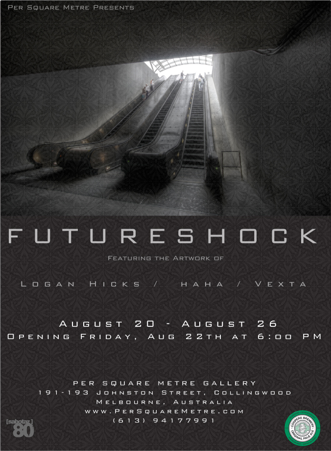
Three artists are exhibiting: Ha Ha, who is something of a Melbourne institution these days (a prolific, highly respected, incredibly influential, and extremely ethical street artist); Vex Ta, a Melbourne artist who is on a trajectory of international stardom and is recently returned from the Cans Festival in London, where she painted alongside some of the best known street artist in the world right now; and Logan Hicks. Logan Hicks is an American artist who has lived overseas but is now based in Brooklyn. And – what can I say – I am a fan of his work.
I had seen images of his work online. Many, many street artists like his work, and his name tends to come up in conversation. He has his own website here. On YouTube, you can watch time-lapse footage of Logan Hicks spraying a stencil:
I had looked at the online images of his work, and had admired what I had seen, but recently I had the chance to stand in the same room as 16 of his works, and that was a stunning experience.
When I was in London in July, a gallery called Black Rat Press was showing his work. The gallery space at Black Rat Press is located in a converted tunnel, so that instead of the standard ‘white cube’ there is a curved arc of exposed brick. The works were hung around this curved, vaguely subterranean room, and the mottled red brick provided a fitting backdrop to them.
Logan Hicks’s images tend to be of urban scenes: tired commuters on the New York subway, gazing into the near distance; a deserted stoop in front of a decaying building; the escalator that descends into a train station; the facade of a building. These images are rendered by means of extremely detailed stencil-making. Hicks appears to cut his intricate shapes with ease: the images appear directly painted rather than transferred through the indirection of a stencil.
His colour palette is sombre – greys, black, more grey. But these monochromal repetitions are counterposed in some of his works to a sudden, astonishingly bright, primary colour. In one image, the sky is red; in another, a window appears golden yellow. The effect, for me, is enormously pleasing: even now, several weeks after seeing them, the works hover in my memory.
I visited the gallery with my partner and our daughter. After a while they went outside, to sit in the sunny courtyard that belongs to Cargo, a tremendously hip Shoreditch bar. (One wall of Cargo’s courtyard is adorned with works by various famed street artists: Logan Hicks has a work on that wall, and so does Shepard Fairey, while two Banksys look demurely out from behind their plexiglass protective cover.)
While Peter and Sophie were outside, I chatted to the gallery staff member who was present. He said the opening night had gone well, and pointed to several red dots next to various works. ‘Wait a minute’, he said, ‘You should see the works like this…’, and he switched off the main gallery lights. In their place a number of small track lights pointed at the images. The metallic lustre of the paint emerged; the images seemed even more to fade into the brickwork. For a moment, gallery became street: image on brick, artificial light turned almost into the gloom of a tunnel.
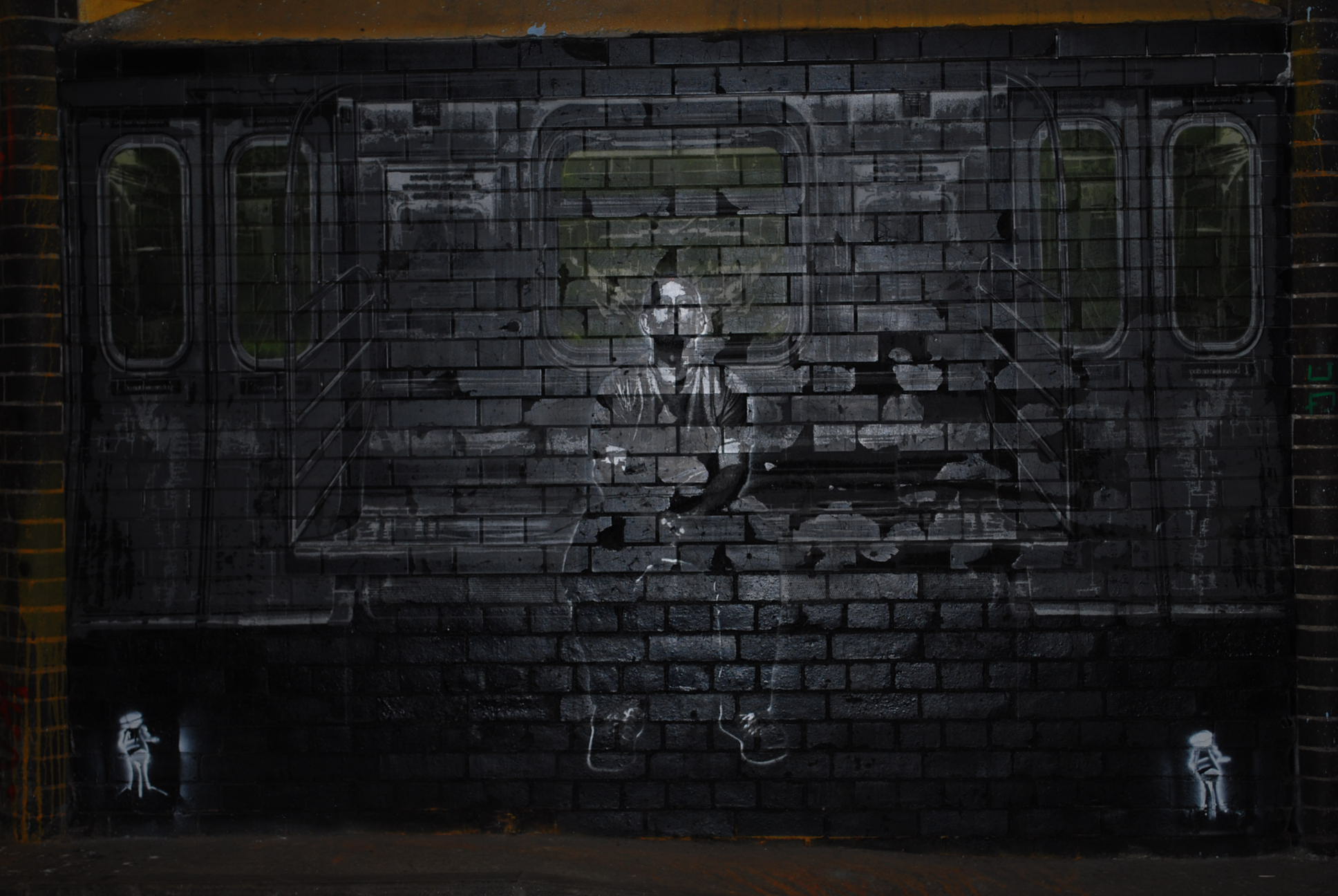
Logan Hicks’s works seem poised at that delicate moment between appearing and disappearing. I felt this acutely when I saw his contribution to the Cans Festival, Banksy’s paintfest in a disused tunnel called Leake Street, near Waterloo Station in London. Hicks was one of the artists invited to participate, and he painted two large works on the brickwork of the walls, in one of the dimmest corners of the tunnel. One is an image of Union Square subway station; another shows a solitary man on a subway train. Both works evoke the city as almost uncannily unpopulated, yet crowded with the machinery of modernity. Both are peaceful yet disquieting images. Both sink into the walls, yet insinuate their images outwards toward the spectator.
Where so much of street art is about getting noticed, Hicks’s work seems almost to be receding away from the viewer. Is it this that captivates me so much?
